
Who is Highway?
Highway is a freight brokerage platform that helps brokers reduce risk by connecting them with verified, trustworthy carriers. Freight brokerage is a high-stakes industry where brokers must quickly assess and find reliable carriers while managing dispatch, sending rate confirmation, and if they meet their load requirements.
Highway is mainly used by brokers to find the right carrier to transport their shipment through their directory. Highway helps brokers by:
● Finding the carriers that meet the requirements of shippers
● Making sure the carrier is verified and trustworthy
● Keeping track of the carrier
● Ensuring safe and timely delivery of the goods
Primary Stakeholders
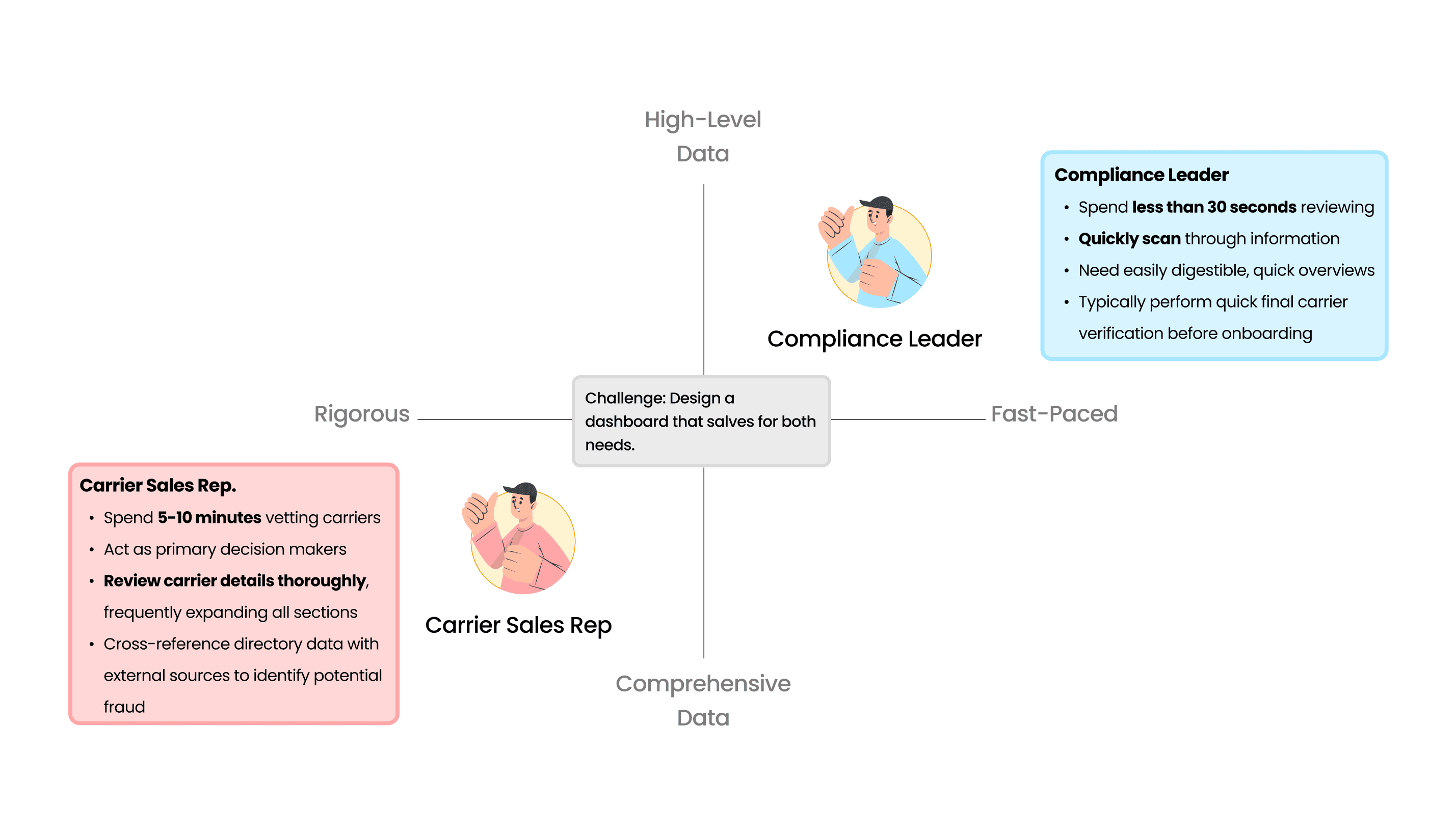
The Highway directory is primarily used by Compliance Leaders (CLs) and Carrier Sales Representatives (CSRs), both of whom rely on the system to evaluate carriers and make risk-based decisions. Although both roles use the same directory, their needs differ significantly. The current system presents large volumes of information without clear hierarchy, making it difficult for CSRs to quickly find what they need while still requiring CLs to manually interpret system logic. This shared but misaligned experience increases cognitive load, slows decision-making, and leads users to rely on workarounds.
What Is the Directory?
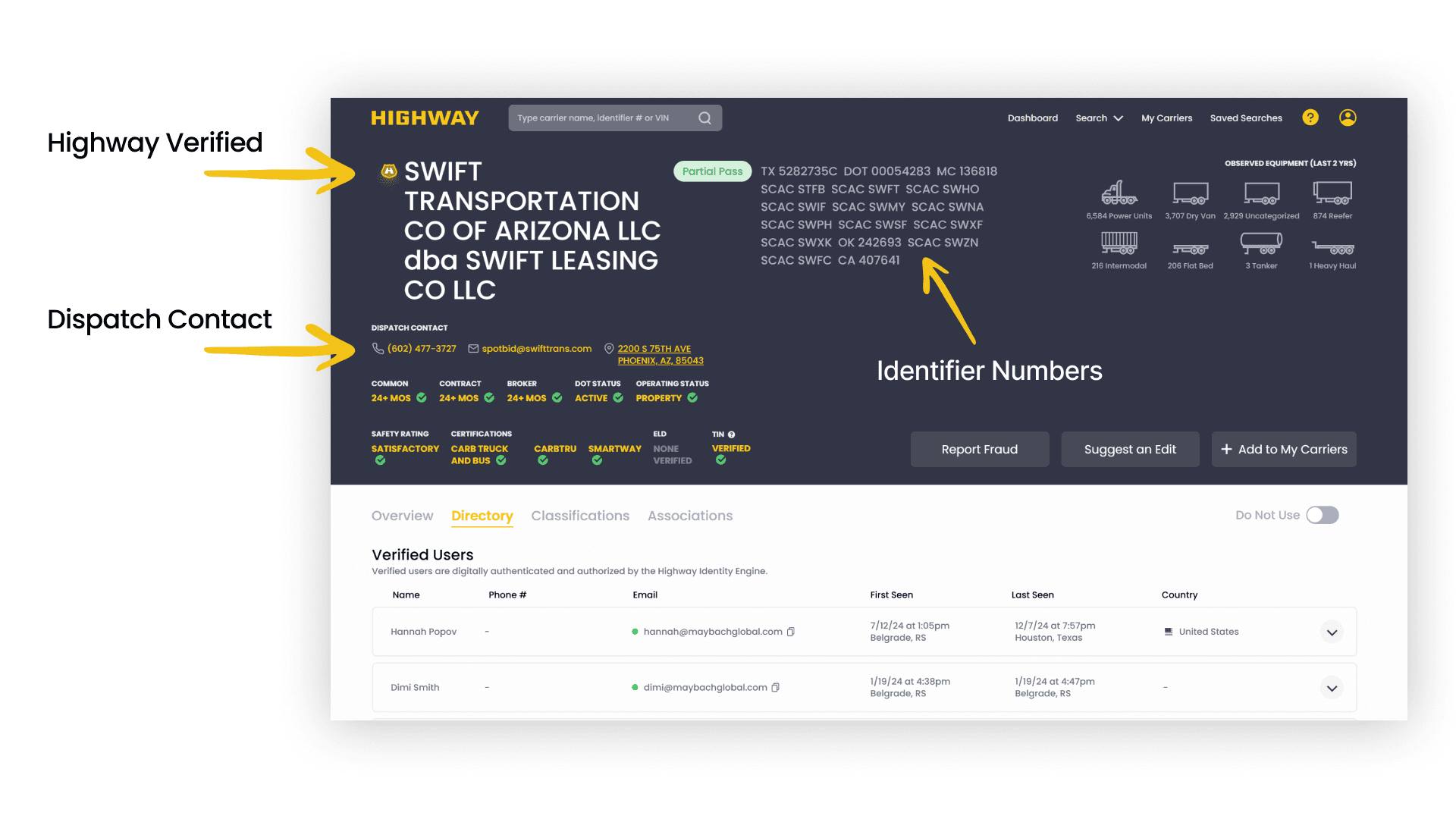
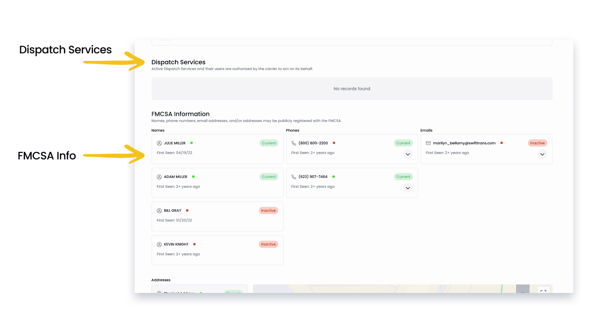
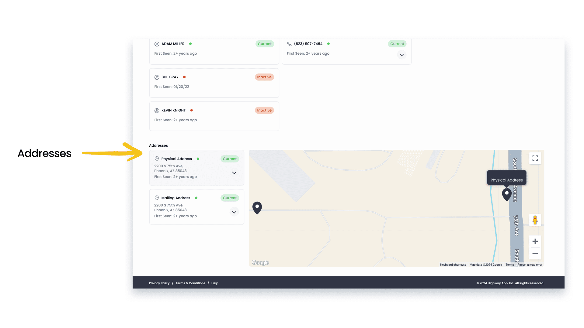
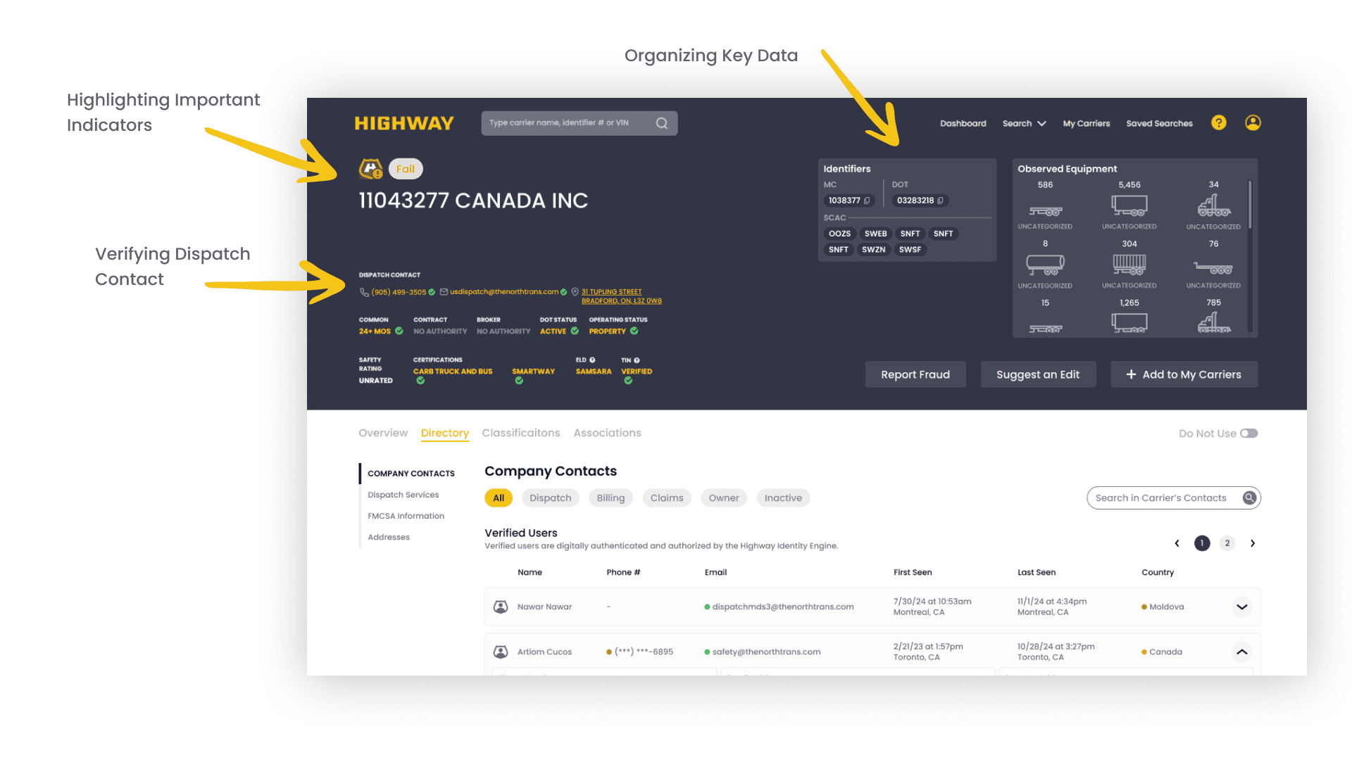
The Directory is part of Highway’s platform that allows stakeholders to access the contact information, dispatch services, and FMSCA information (information registered publicly with the Federal Motor Carrier Safety Administration) for those who are associated with the respective carrier. Some other issues/risks involved in this process are -
● Damaging of products
● Theft
● Non-compliance with the rules and policies
● Double-brokering
How do we streamline the workflow to better serve each stakeholder, ensuring the platform provides the right amount of detail for everyone to make more informed decisions?
Initially, our problem statement was how do we redesign a complex data-heavy interface to prioritize relevant information and improve decision-making for freight brokers? After speaking with our sponsor and initial stakeholder interviews we realized that the real challenge was optimizing the workflow. Our new goal is understanding how gaps in the current workflow hinders the decision making process for each stakeholder.
3 challenges we identified in Highway’s Directory
Information overload
Complex contact findability
Unclear system logic

The re-designed directory reduces the cognitive load by improving visual hierarchy, clarifying system logic, and supporting both quick evaluation and deeper investigation to serve both CLs and CSR workflows.

How did we streamline two different workflows?
As a UX researcher on this project, I helped lead and synthesize findings from platform audits, contextual inquiries, stakeholder interviews, and evaluations to understand how different users navigate and make decisions within Highway’s Directory.
We structured our work around four key focus areas, each addressing its own different challenge but interconnected by a common goal to enhance the usability of users through thorough user research and design. While the Directory serves multiple stakeholders, our research revealed that the way information is currently presented does not adequately support the different workflows and decision-making needs of Compliance Leaders (CLs) and Carrier Sales Representatives (CSRs).
Although both roles rely on the same data, they interact with it in fundamentally different ways. CSRs require quick validation and high-level signals to make fast booking decisions, while CLs need detailed, transparent information to conduct thorough investigations and mitigate risk. The lack of clear hierarchy, inconsistent system logic, and information overload within the Directory made it difficult for either group to efficiently complete their tasks.
To address these challenges, we divided our process into four focus areas. Each focus area targets a specific breakdown in the current experience, while collectively working toward improving usability, reducing cognitive load, and streamlining the decision-making workflow for all stakeholders. Our insights and findings are a result of various platform audits, contextual inquiries,stakeholder interviews and evaluations. This research approach ensures that our findings are comprehensive, reliable and can help improve the overall user experience.
Four Focus Areas:
Focus Area 1: Comparing system Models to Mental Models
Focus Area 2: Reducing Noise and Clutter in the Directory
Focus Area 3: Simplifying the Decision-Making Workflow for Stakeholders
Focus Area 4: Bringing Everything Together
Focus Area 1: Comparing system Models to Mental Models
This focus area examined the gap between how brokers expect the Directory to function and how the system actually behaves. Through contextual inquiries and stakeholder interviews, we found that users often struggled to understand indicator logic, terminology, and data reliability, leading to hesitation and reliance on workarounds. Compliance Leaders and Carrier Sales Representatives approached the same data with different expectations, revealing misalignment between system design and real-world decision-making processes.
To better understand the misalignment identified in this focus area, we developed a user mental model that captures how brokers think, feel, and act while vetting carriers using the Directory. This model represents real-world decision-making across three primary stages—Carrier Verification, Order Concern, and Carrier Confirmation—reflecting both Compliance Leader and Carrier Sales Representative workflows.
The mental model highlights moments where users experience caution, confusion, overwhelm, or urgency as they move through data collection, directory-based risk analysis, fraud vetting, and final decision-making. These emotional states frequently align with breakdowns in system logic, such as unclear indicator behavior, inconsistent terminology, or difficulty understanding which data points drive risk assessments. By mapping user actions alongside emotional responses and system behavior, this model makes visible where expectations and system design diverge.
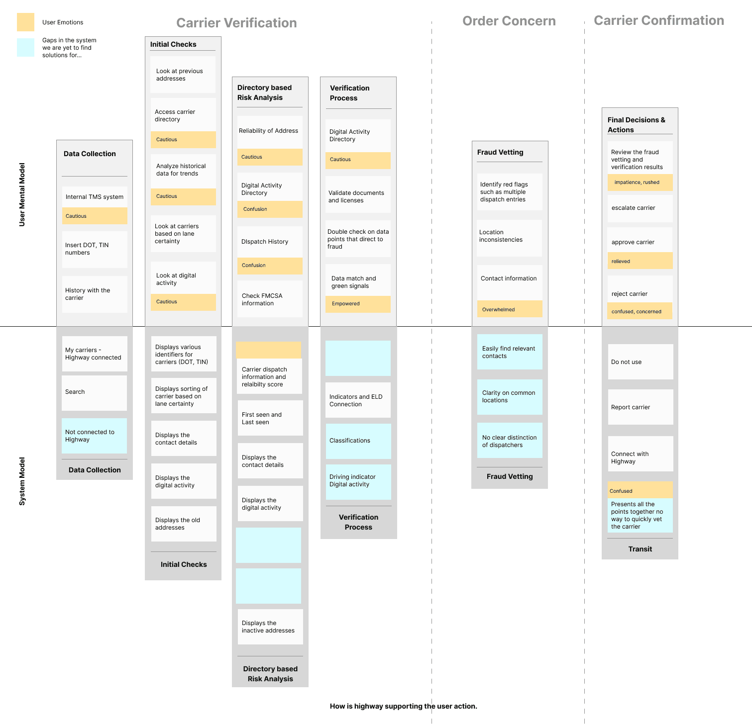
Why This Matters
This mental model helped shift the problem framing from “users need better data” to “users need better alignment between system behavior and their decision-making process.” Understanding where confusion and hesitation occurred allowed us to identify which moments required clearer hierarchy, stronger verification signals, and more transparent system logic. This led to identifying 3 main points of confusion when users were interacting with the directory.
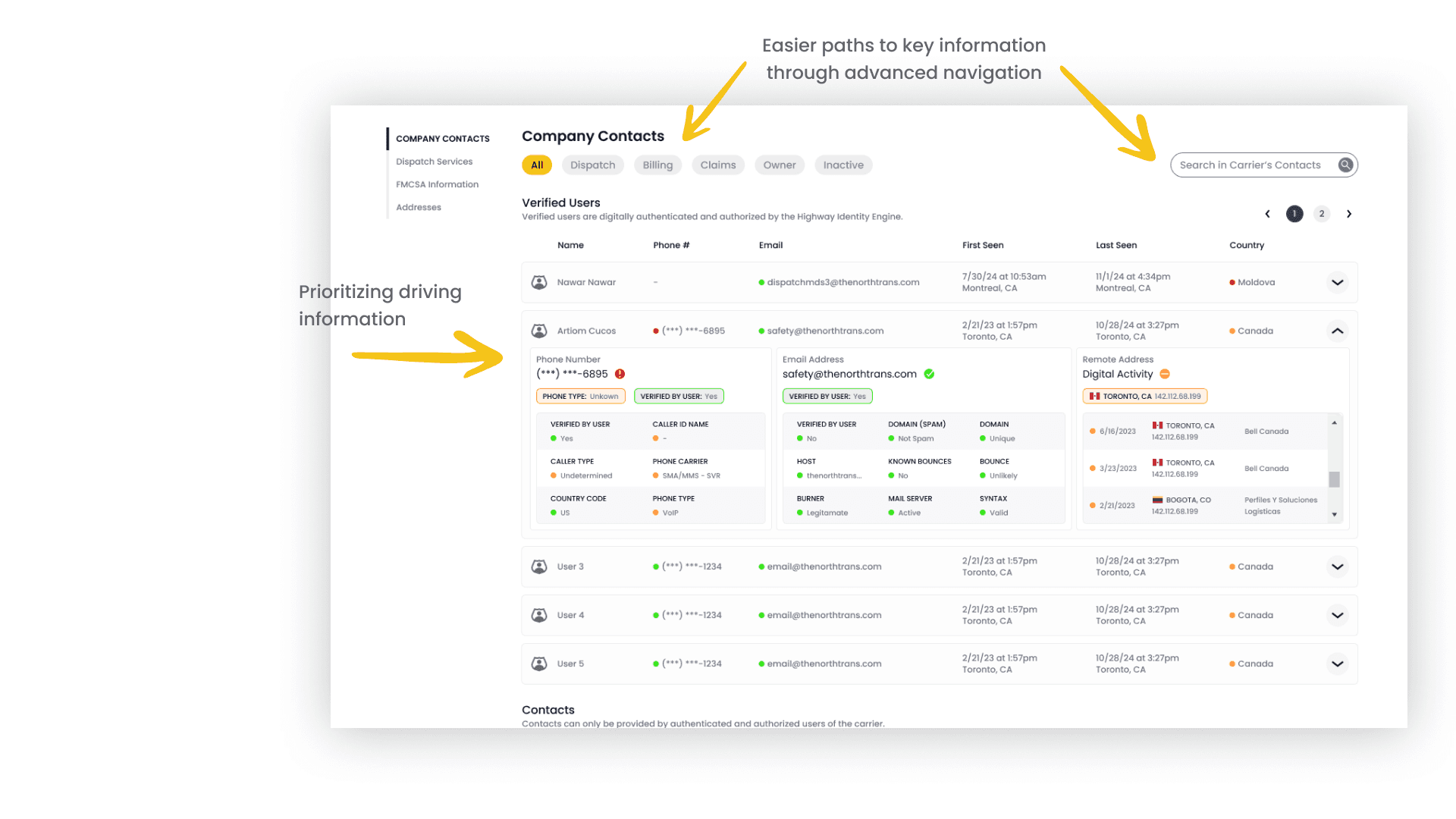
Mismatched Color Indicators
Color-coded indicators were intended to provide quick visual cues, but inconsistent usage across the platform caused confusion. The same colors often represented different meanings depending on context, forcing users to interpret risk and verification status rather than understand it at a glance.Conflicting Terminologies
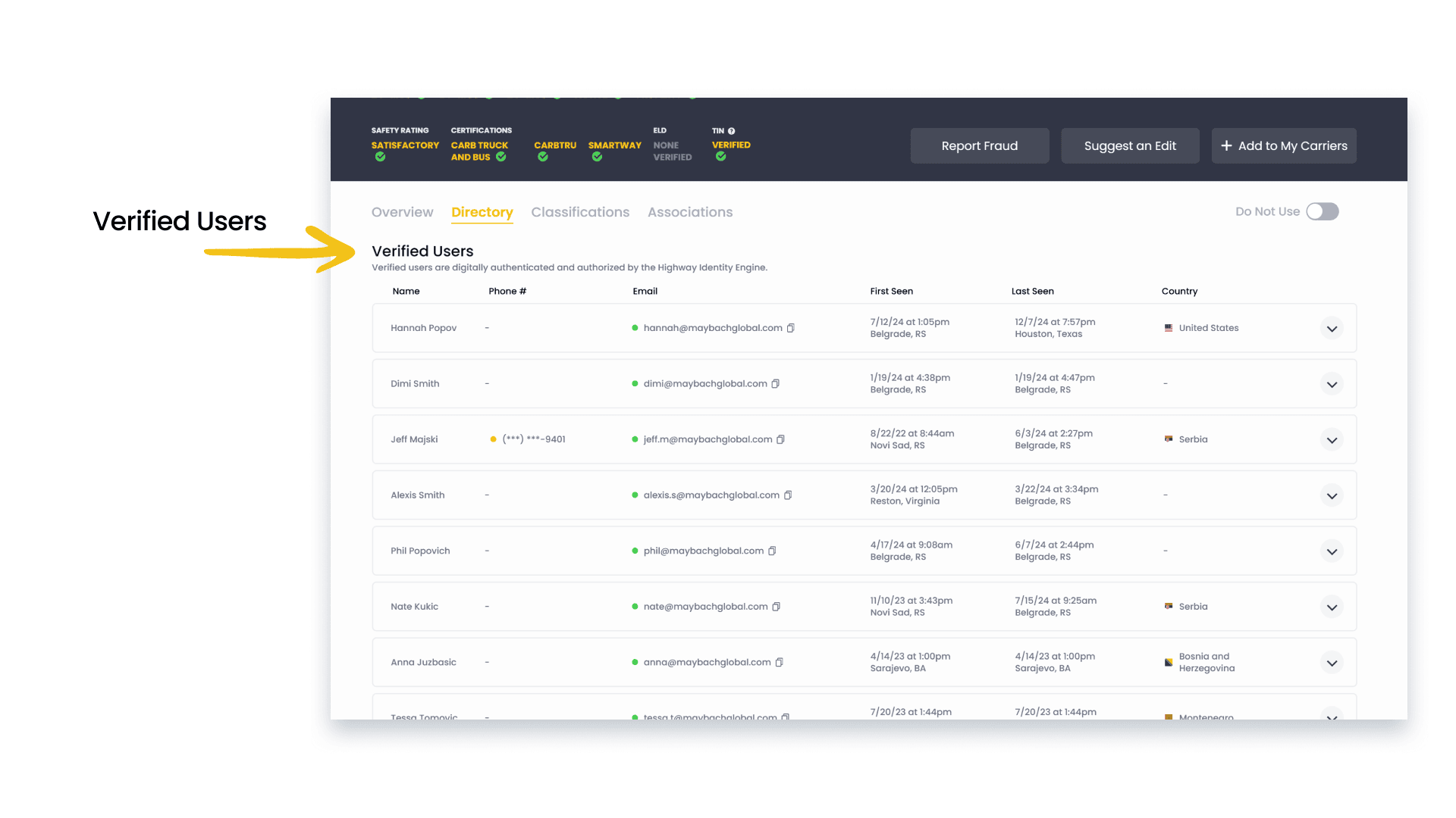
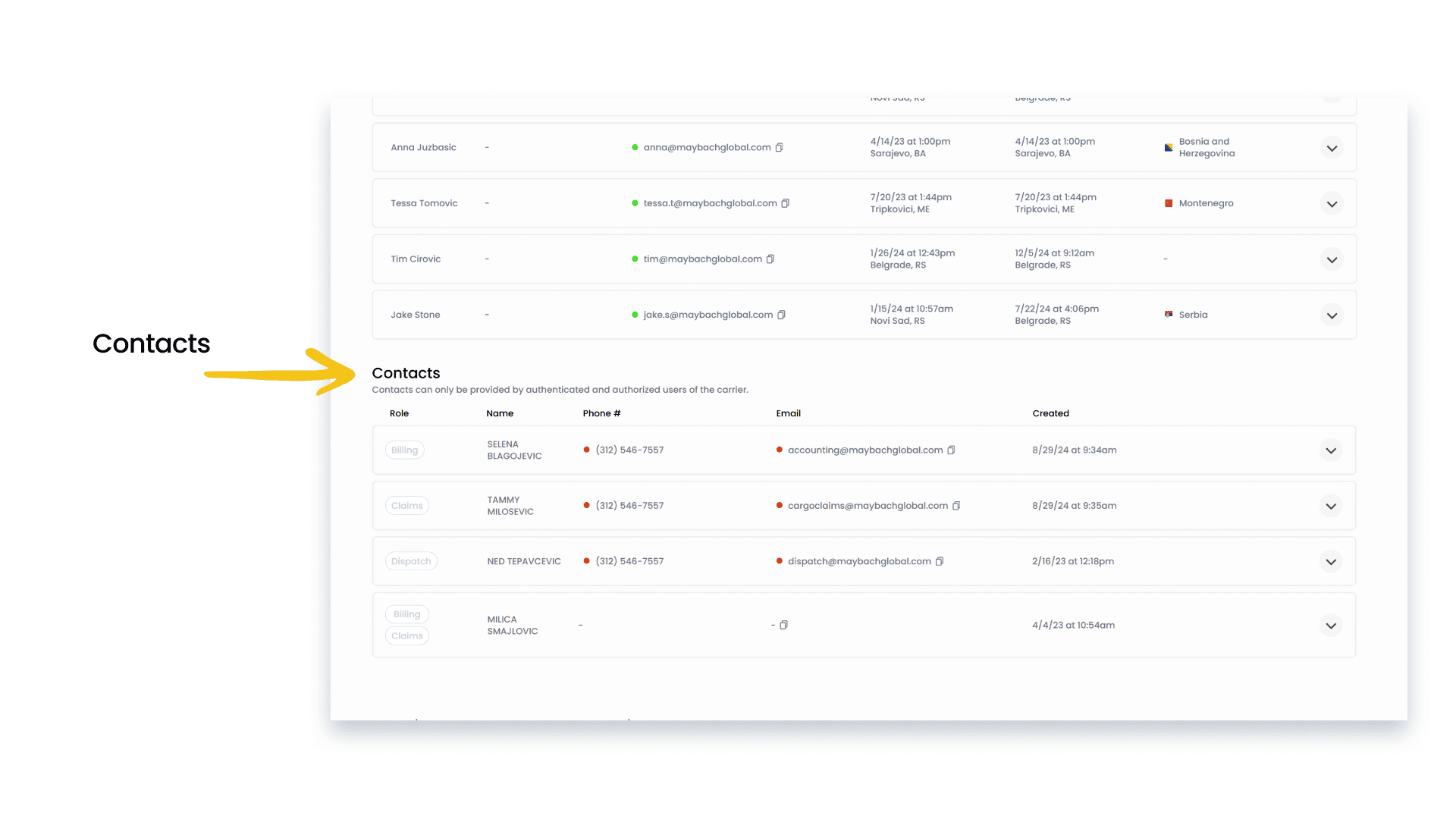
Overlapping and inconsistent terminology—particularly between “Verified Users” and “Contacts”—made it difficult for brokers to determine which information was most reliable. Users frequently had to cross-reference sections and interpret unclear labels, slowing workflows and increasing frustration.Unclear System Logic
Users lacked transparency into how data was sourced, validated, and updated within the Directory, especially when discrepancies appeared between Highway and external sources like FMCSA. This uncertainty reduced trust in the system and led brokers to rely on external tools or workarounds to confirm information.
Key Insight: Users struggled not because the Directory lacked information, but because the system behaved differently than they expected. Misalignment between user mental models and system logic—particularly around indicators, terminology, and verification—caused hesitation and forced users to rely on assumptions or workarounds during critical decision points.
Focus Area 2: Reducing Noise and Clutter in the Directory
Our research revealed that the Directory surfaces large volumes of information with limited hierarchy, making it difficult for users to quickly identify what is most relevant. Brokers frequently ignored or collapsed sections that felt overwhelming or unreliable, while critical contacts and indicators were often buried beneath less actionable data. This focus area highlighted how information overload increased cognitive load and slowed decision-making, particularly for CSRs operating in time-sensitive workflows.
Main Issue in the Directory
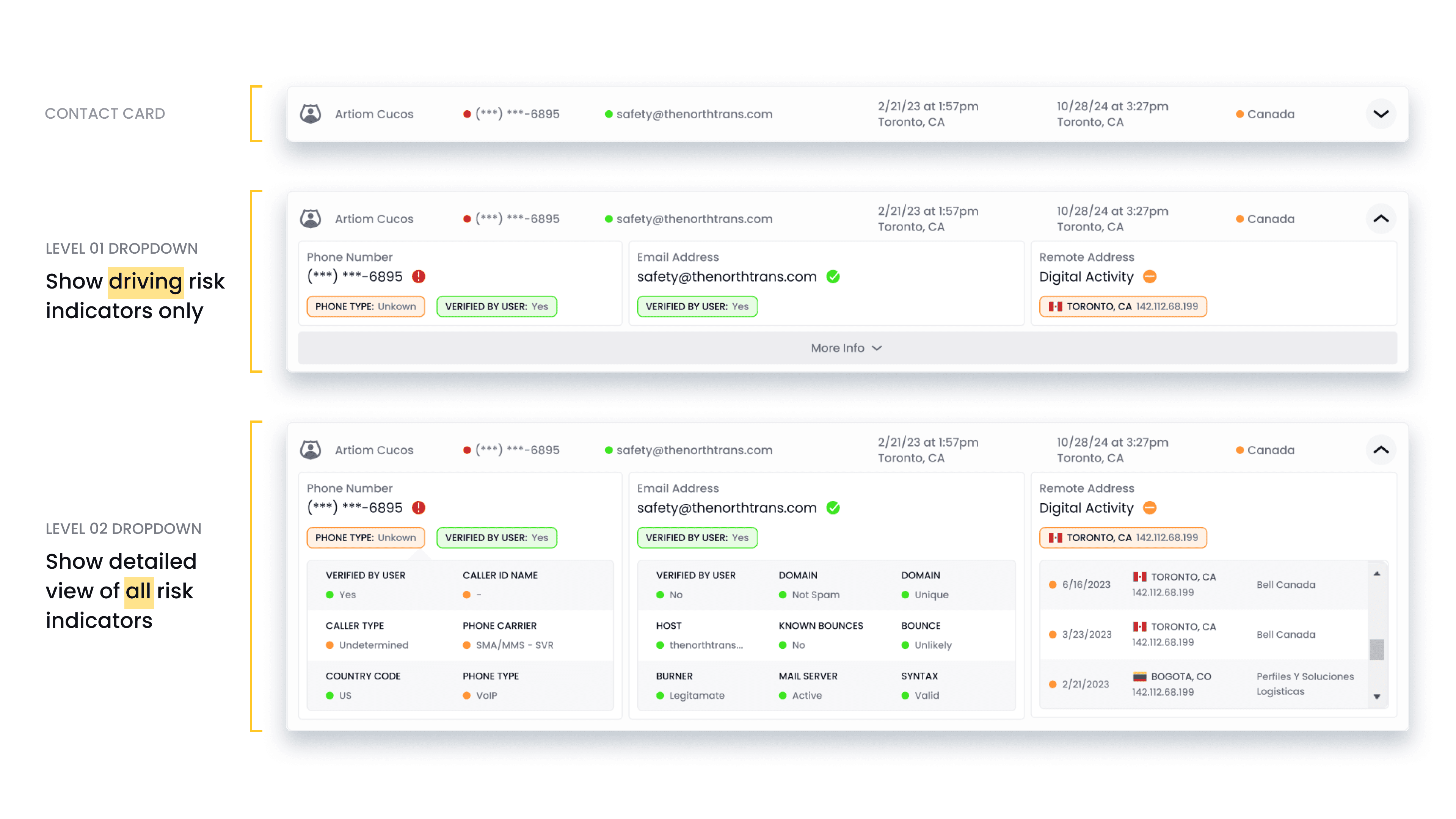
One of the primary issues within the Directory was the way visual indicators, particularly color-coding, contributed to information noise rather than clarity. Although indicator dots were designed to quickly communicate risk and verification status, research showed that inconsistent color meanings and a lack of transparency around how indicators were assigned made them difficult for users to interpret with confidence. Brokers frequently questioned what specific colors represented and whether those signals could be trusted.
As a result, users often deprioritize color indicators altogether, instead relying on verified contacts or external validation to make decisions. This breakdown highlighted how unclear visual signaling increased cognitive load and undermined the Directory’s ability to support quick, reliable decision-making, reinforcing the need for clearer hierarchy and more intuitive communication of risk and status.
Why This Matters
The Directory is where high stake decisions are made to quickly assess risk and determine which carriers and contacts can be trusted. When visual indicators like color-coding are unclear or inconsistent, users lose confidence in the system, hesitate during critical moments, and rely on workarounds or external tools. This not only slows workflows but increases the risk of misinformed decisions, undermining the Directory’s role as a trusted source for carrier verification.
Key Insight: Information overload made it difficult for users to identify what was most relevant at a glance. When too much data was presented without clear hierarchy, users ignored or collapsed sections entirely, increasing the risk of missing critical signals and slowing down time-sensitive workflows.
Focus Area 3: Simplifying the Decision-Making Workflow for Stakeholders
This focus area explored how unclear system logic—such as inconsistent color usage, overlapping contact information, and ambiguous verification signals—negatively impacted user confidence and efficiency. Brokers often had to cross-reference multiple sections to validate contacts or interpret risk indicators, adding unnecessary friction to the workflow. These inconsistencies made it difficult for users to understand what data to trust and how risk assessments were being formed.
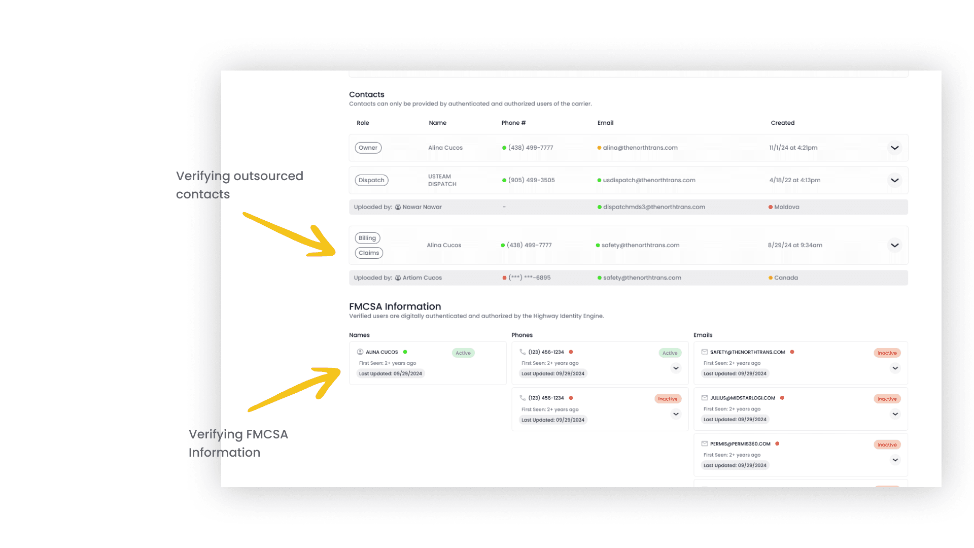
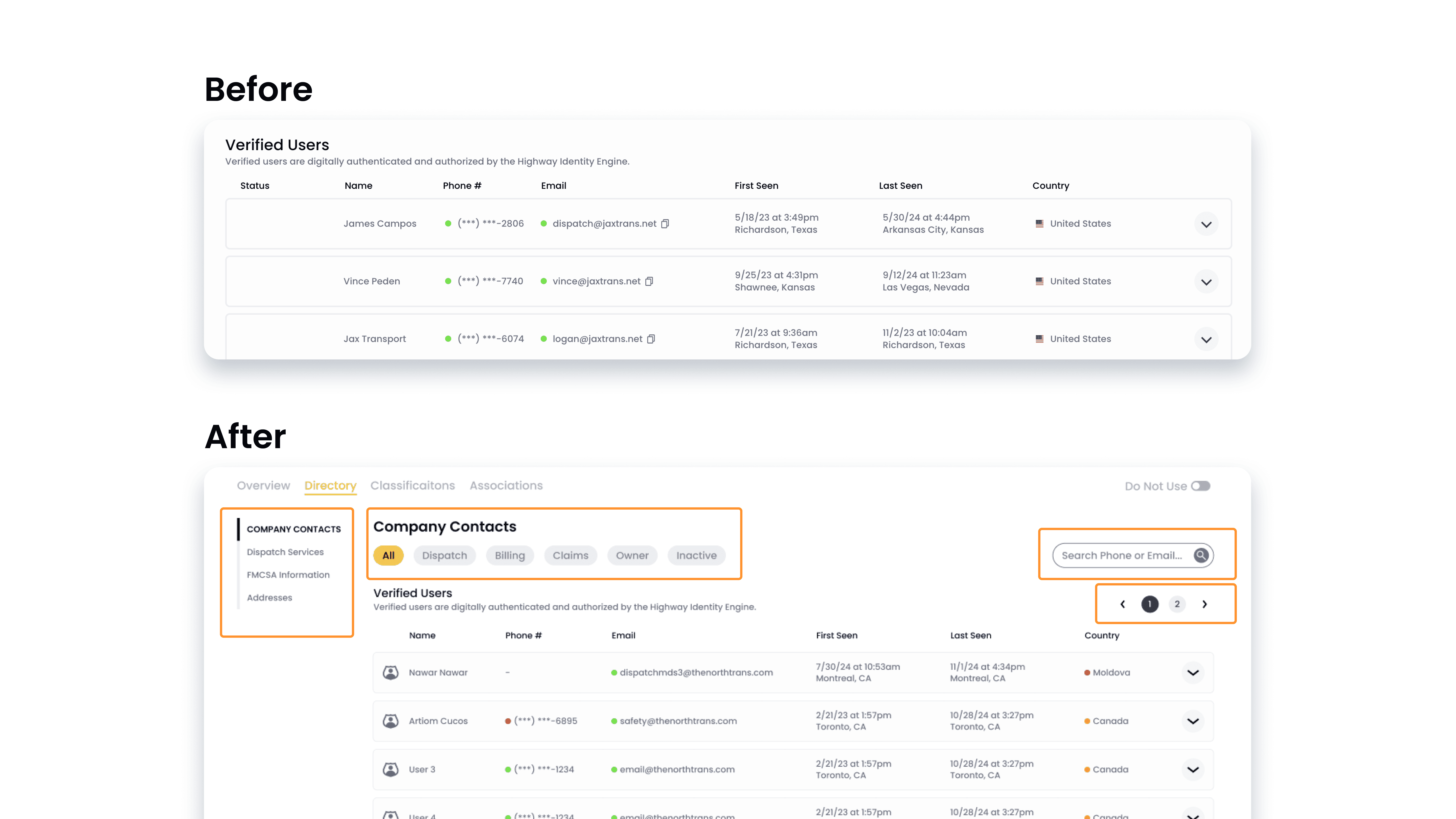
Contact Findability
The contacts section is a critical yet problematic part of the Directory experience. Brokers frequently rely on contacts such as dispatch, billing, and claims to move loads forward, often under tight time constraints. However, the way contact information was organized and presented made it difficult for users to quickly determine which contacts were reliable and relevant.
The separation between “Verified Users” and “Contacts,” combined with overlapping entries and a lack of clear source attribution, forced brokers to cross-reference multiple sections to validate contact credibility. In practice, this increased cognitive load and slowed workflows, particularly for Carrier Sales Representatives who needed fast confirmation. The Contacts section surfaced as a key area where unclear hierarchy, redundancy, and missing context directly impacted trust and decision-making, making it a central focus of our research.
Why This Matters
Unclear contact credibility slows time-sensitive workflows and increases the risk of misdirected or fraudulent communication. When brokers cannot quickly identify trustworthy contacts, the Directory fails to function as a reliable decision-making tool.
Key Insight: Unclear system logic—such as inconsistent color usage, overlapping contacts, and ambiguous verification signals—undermined user confidence in the data. Users were forced to cross-reference multiple sections to validate information, adding friction and reducing trust in the Directory as a reliable decision-making tool.
Focus Area 4: Bringing Everything Together
The final focus area synthesized insights from the previous three to understand how system logic, information hierarchy, and user expectations intersect within the Directory experience. By examining these elements together, we identified opportunities to better support both quick evaluation and deeper investigation within a single interface. This focus area provided the foundation for translating research insights into cohesive design decisions that streamline workflows while maintaining data transparency and trust.
Key Insight: The Directory needed to support both quick evaluation and deep investigation without fragmenting the experience. Addressing individual usability issues in isolation was insufficient; meaningful improvement required aligning system behavior, information hierarchy, and user expectations into a cohesive, role-flexible workflow.